
The 5 Best Uniforms in NFL History (And the Stories Sewn Into Them)
Every great uniform is an accident, a dare, or a love letter. These five are all three — ranked, argued, and fully documented. Fight us in the comments.
Every great uniform is an accident, a dare, or a love letter. These five are all three — ranked, argued, and fully documented. Fight us in the comments.
5. Chicago Bears — The Uniform Time Forgot to Change
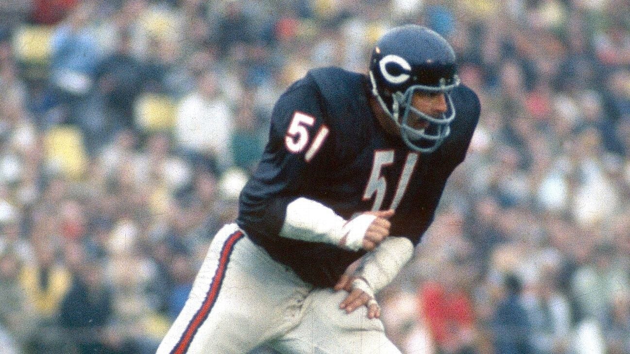
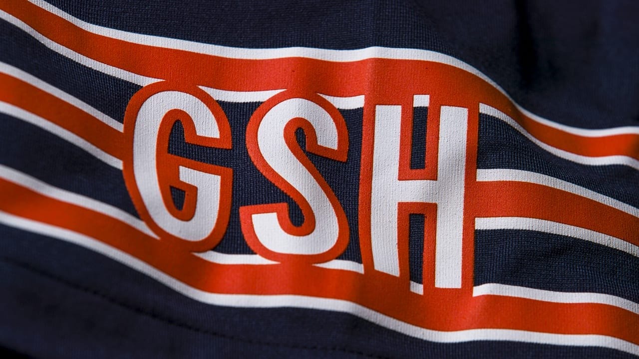
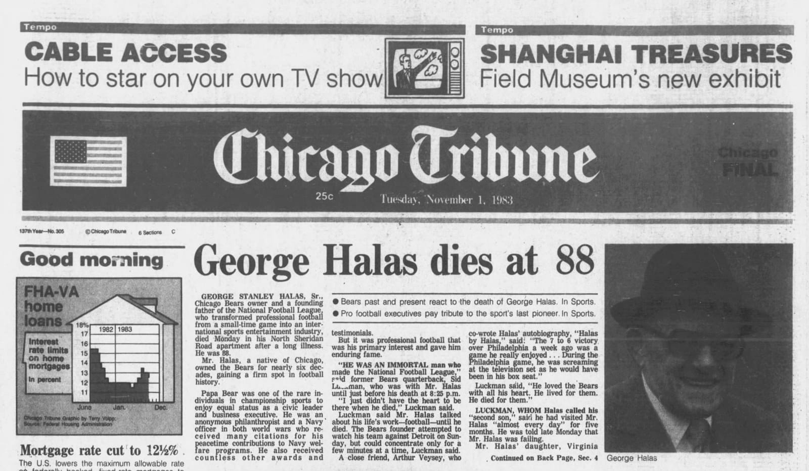
The Bears have worn navy and orange for over a century — George Halas lifted the colors from his alma mater, the University of Illinois, and never saw a reason to stop. The wishbone "C" landed on the helmet in 1962 (in white, of all things) and turned orange in 1974. The only real change since? Three small letters — GSH — added to the left sleeve in 1984, the year after George Stanley Halas died. The founder has ridden on every Bears jersey sleeve for four decades.
Why it's iconic: It's the closest thing football has to the Yankees pinstripes. Nothing to add. Nothing to remove.
4. Pittsburgh Steelers — The Logo That's Only Half There
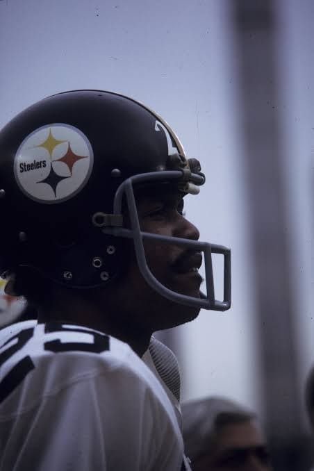
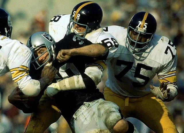
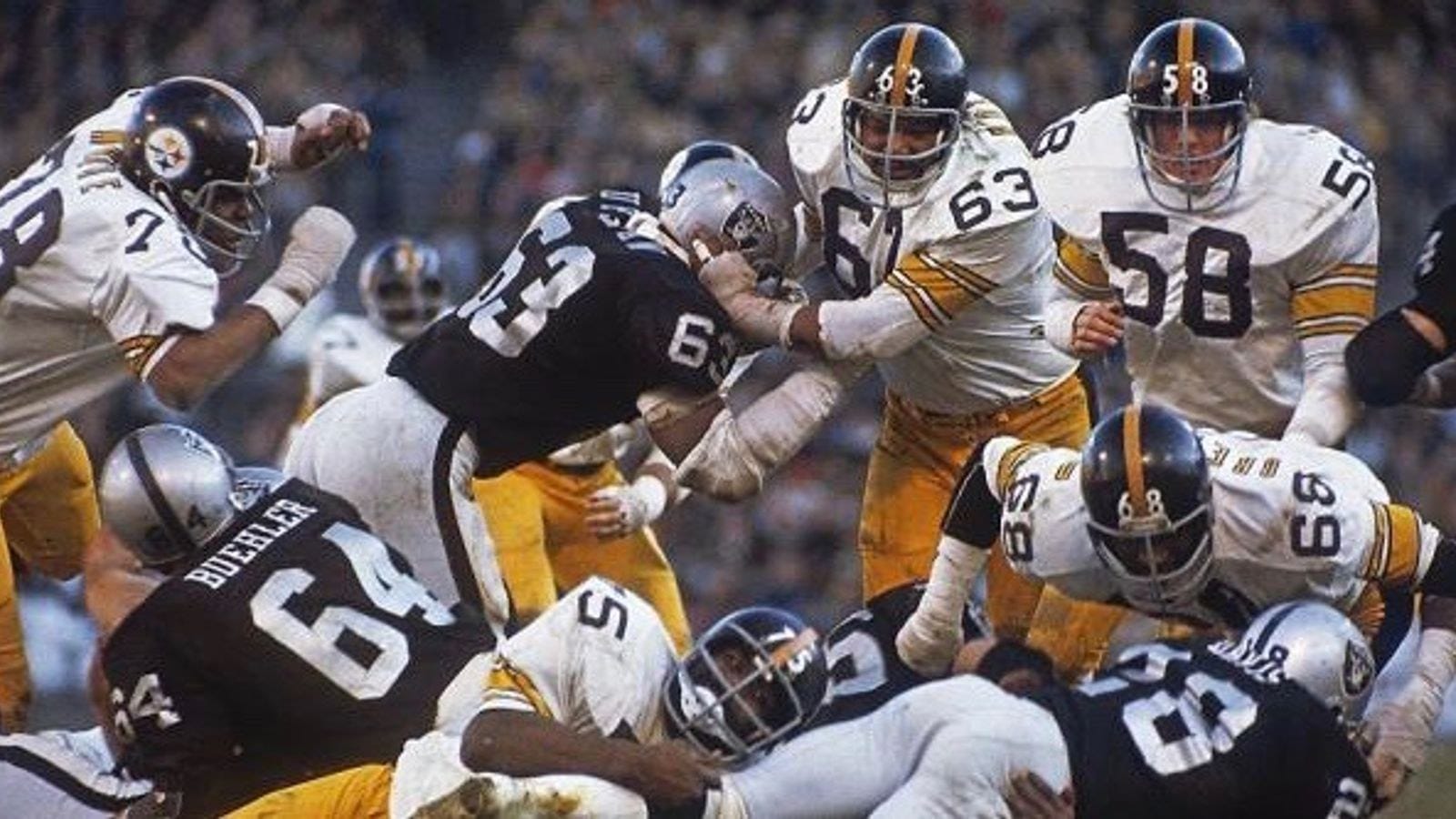
Look closely at a Steelers helmet: the logo is only on the right side. That's not design genius — in 1962, equipment manager Jack Hart was told to stick the brand-new Steelmark decal on one side as a test, because nobody was sure it would look good on the team's gold helmets. The team liked it, never bothered to finish the job, and 60-plus years later they remain the NFL's only one-sided helmet.
The logo itself wasn't even theirs — it's the Steelmark, created by U.S. Steel to sell literal steel, its three diamond shapes standing for the ingredients of steelmaking: yellow for coal, orange for iron ore, blue for steel scrap. When that 1962 team made the franchise's first postseason, they switched to black helmets to make the decal pop — and in 1963 got permission to change "Steel" to "Steelers" inside the mark.
Why it's iconic: The whole city's industry, on one side of a helmet, by accident.
3. Houston Oilers — Luv Ya Blue
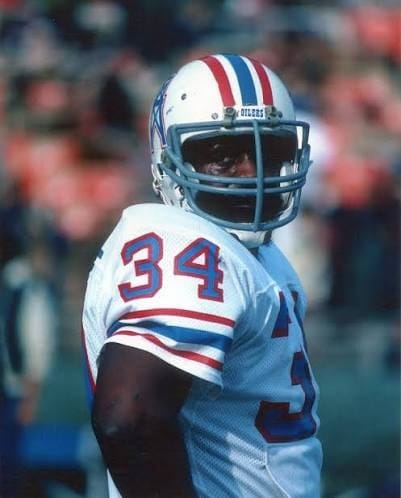
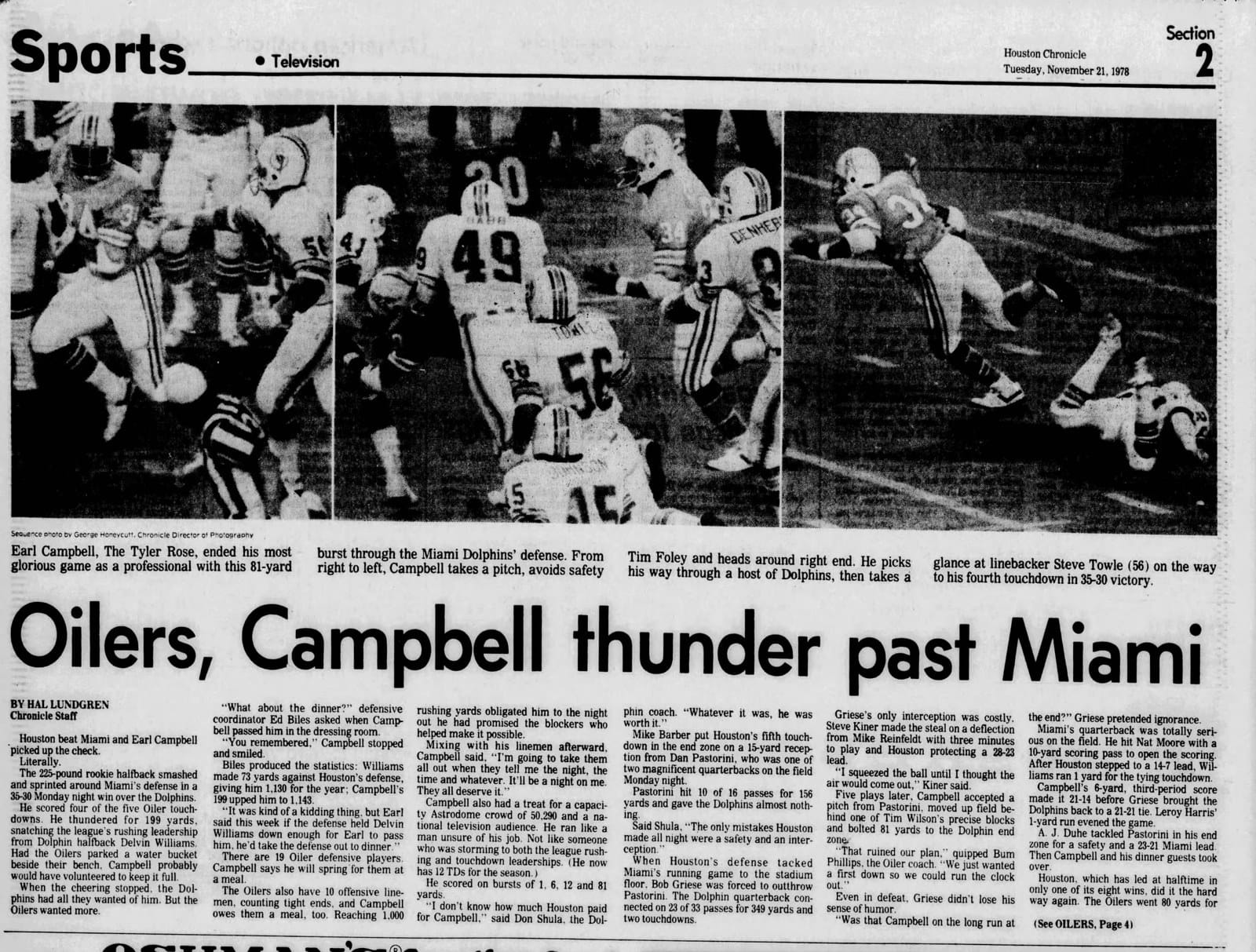
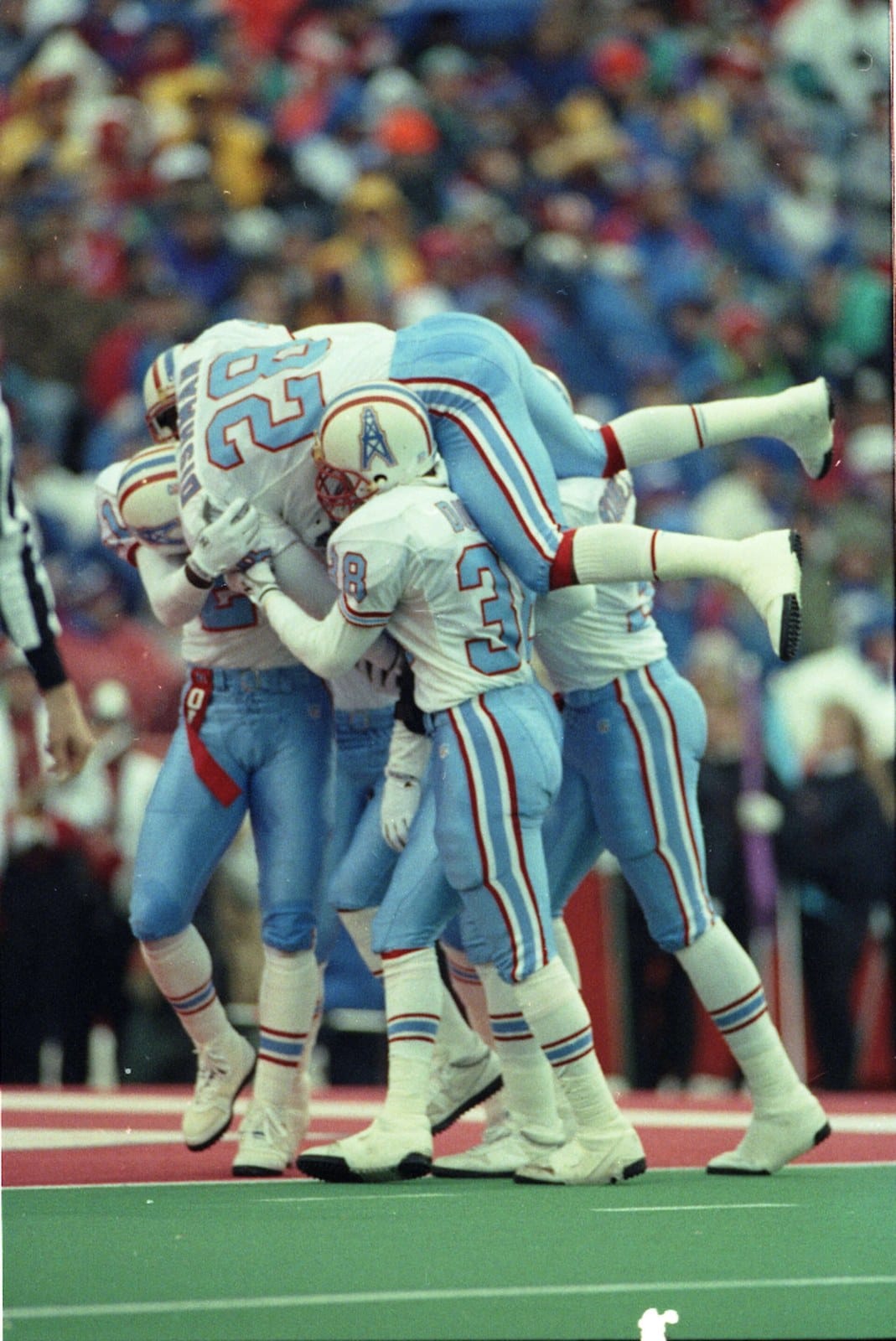
Columbia blue from the franchise's first AFL snap in 1960 — owner Bud Adams borrowed the palette from Kansas football — with an oil derrick on the helmet, because Houston. But the uniform became legend from 1978 to 1980, when Bum Phillips, rookie battering ram Earl Campbell, and a pom-pom-filled Astrodome turned "Luv Ya Blue" into pro football's greatest love affair between a city and a team. Campbell's four-touchdown Monday night demolition of Miami in 1978 lit the fuse; two straight AFC title game runs kept it burning.
Why it's iconic: No uniform has ever matched its city's mood better. Columbia blue was Houston for three years.
2. Los Angeles Rams — The First Helmet Logo in Football History
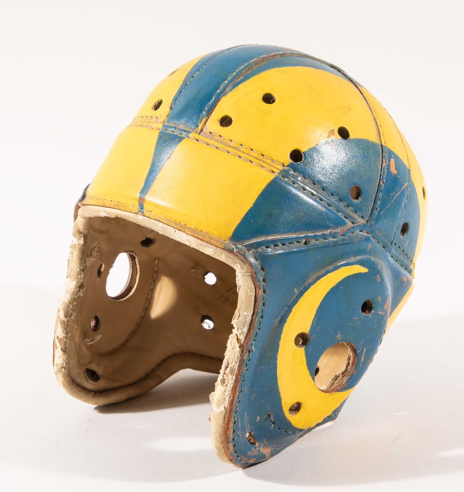
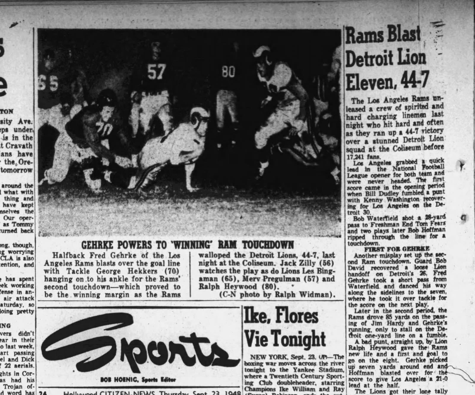
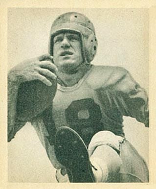
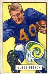
Before 1948, every helmet in pro football was blank. Then Fred Gehrke — a Rams halfback who happened to be an art major from Utah — spent an entire summer hand-painting ram horns on 75 leather helmets at a dollar apiece. When the Rams ran out of the tunnel wearing them, the Coliseum crowd stood and roared. And because leather helmets chip, Gehrke repainted them after every single game — the NFL's first helmet logo was maintained by hand, by the guy wearing one. Within a few years, every team wanted a logo; by 1949, Riddell was molding the horns into plastic. Gehrke's original hand-painted helmet sits in Canton.
Why it's iconic: Every logo on every helmet in football descends from one player with a paintbrush.
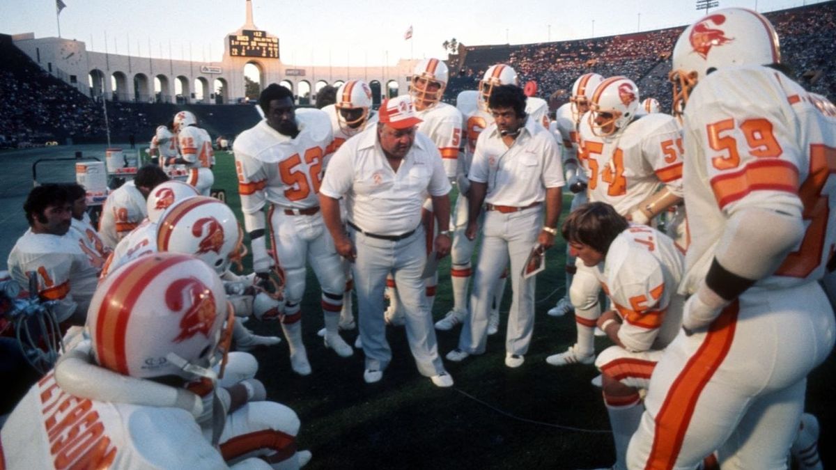
1. Tampa Bay Buccaneers — The Creamsicle
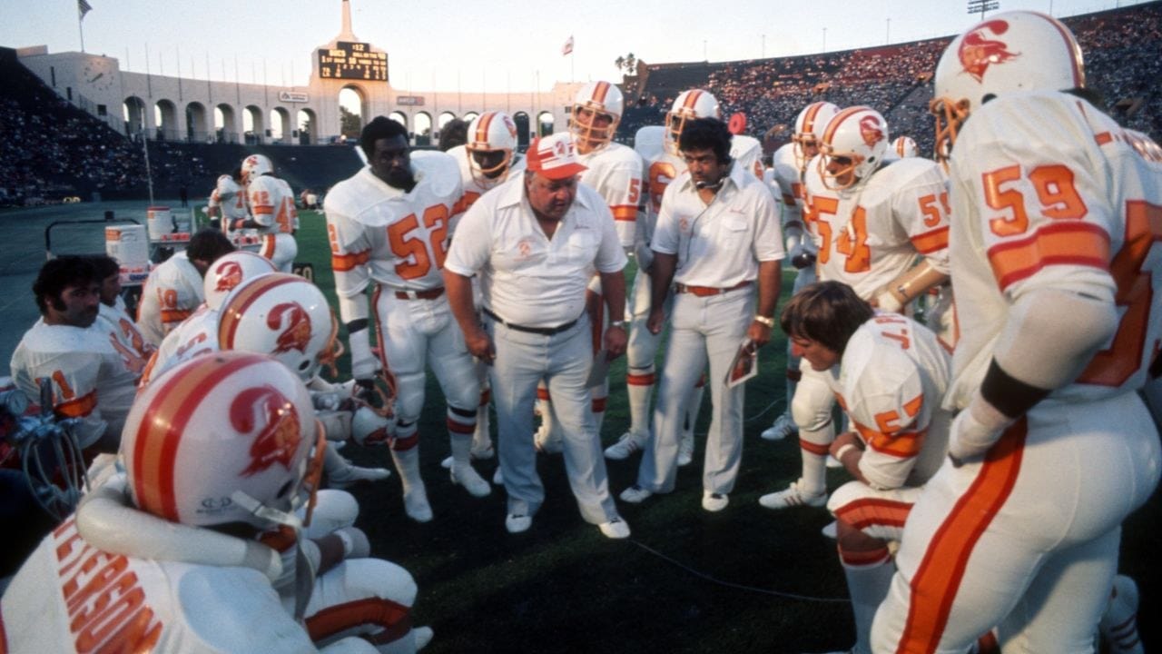
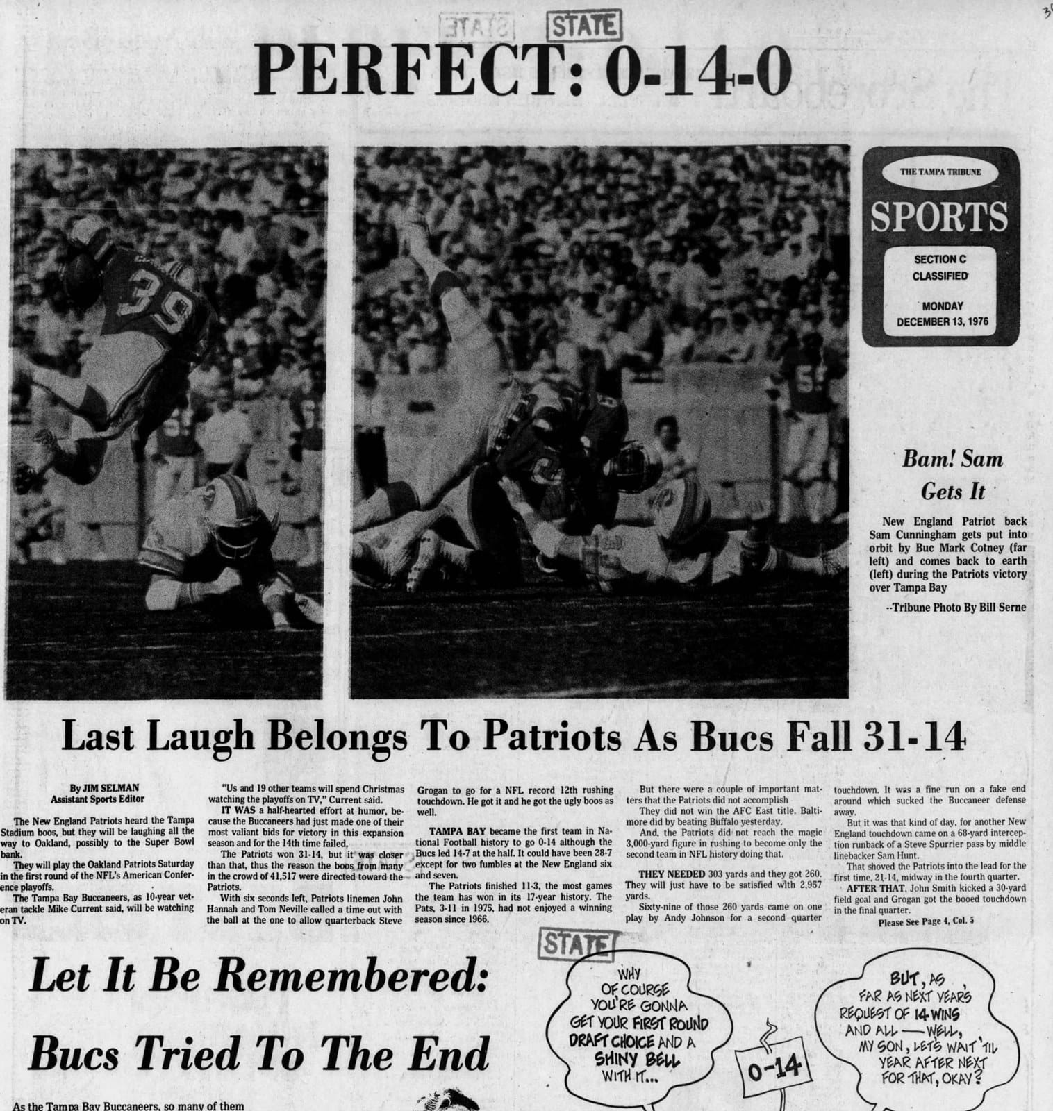
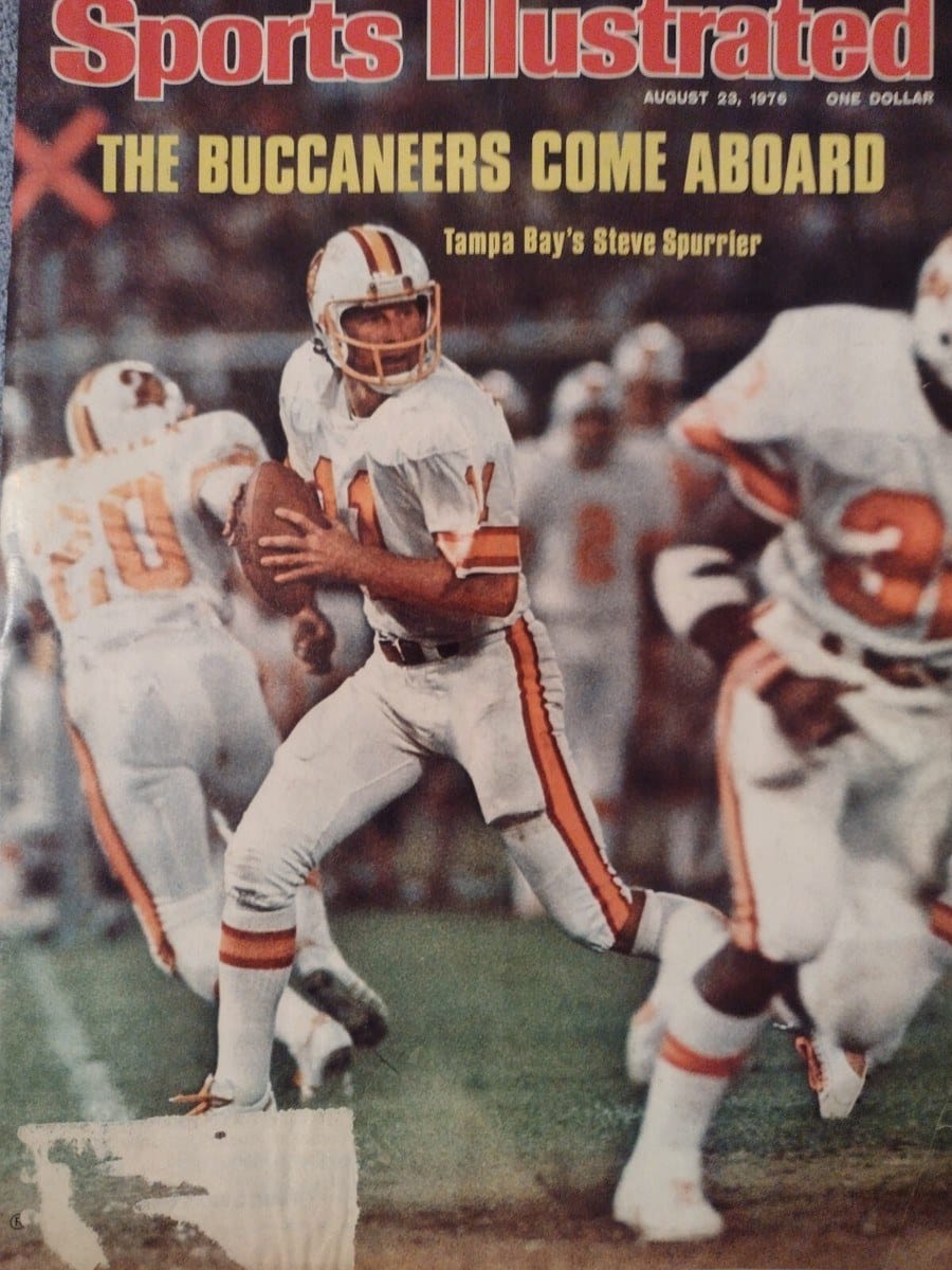
Orange like a sunset. A winking pirate with a dagger in his teeth — Bucco Bruce, drawn by Tampa Tribune cartoonist Lamar Sparkman. And a debut season, 1976, in which the Buccaneers went 0-14 and eventually lost their first 26 games as a franchise. The greatest uniforms in NFL history belong to the worst team the NFL has ever produced, and that is precisely the point: the creamsicles are beloved because they suffered. Retired after 1996, banished for years by the league's one-helmet rule, they returned in 2023 to instant sellouts — proof that no rebrand ever beats a beautiful failure.
Why it's iconic: Sixty years of NFL branding, and nobody has ever out-designed the 0-14 team.
Honorable Mentions
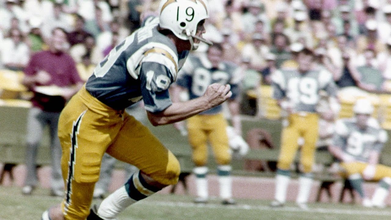
San Diego Chargers powder blue (1960–73) — Barron Hilton put lightning bolts on everything because he liked the Air Force Academy's helmets. Perennial winner of every "best uniform ever" poll, including this section.
Oakland Raiders silver and black (1963) — the Raiders wore black and gold until 33-year-old Al Davis showed up and repainted the franchise into a menace. One coach, one year, one of the most copied color schemes in sports.
Green Bay Packers "G" (1961) — Lombardi wanted "GB." Equipment manager "Dad" Braisher and a St. Norbert art student gave him the oval G instead — and the Packers won the championship in its debut season. (It stands for Green Bay, not "Greatness." Sorry.)
Which uniform did we rob? The powder blues have a case. Argue with us on Twitter.
Comments ()